Redesigning a complex university IT portal around how people actually find information.
University of Washington’s IT Connect is a campus-facing portal providing technology resources, instructions, how-to documentation, and quick-start guides for students, faculty, and staff. The site’s information architecture had been developed almost a decade earlier and had become difficult to navigate.
Role: Senior UX Designer
Focus: Information Architecture · UX Research · Navigation · Interaction Design
Methods: Competitive Analysis · Surveys · Interviews · Focus Groups · Card Sorting · Tree Testing · Prototyping
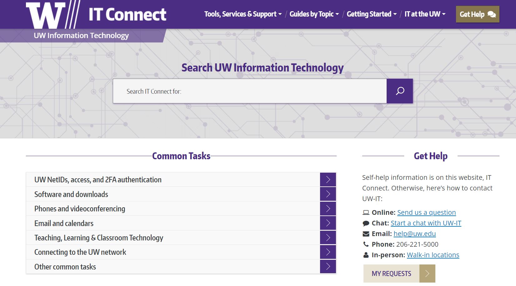
The Challenge: How might we make a decade-old university IT portal easier to navigate and more useful for a diverse UW community?
An information-rich site had become difficult to navigate. IT Connect served a wide range of UW users looking for technology information—from software and support to instructions and resources for teaching, learning, research, and administration. The existing information architecture and site design were nearly a decade old. Users struggled to understand where information belonged and how to navigate the site’s content. The project focused on improving the site’s global experience, including:
- Information architecture
- Navigation
- Header and footer
- Homepage
- Content organization
- Search and discovery
The goal wasn’t simply to redesign the interface. It was to understand how the UW community expected to find IT information and use that understanding to create a clearer, task-oriented structure.
My Role
Senior UX Designer
I led and contributed to the UX research and design process, translating user feedback and research findings into recommendations for the site’s information architecture, navigation, and overall experience. My work included:
- Competitive analysis
- User surveys
- User interviews
- Focus groups
- Card sorting
- Tree testing
- Information architecture
- Navigation concepts
- Interactive prototyping in Figma
The project involved both end users and content producers, balancing how people wanted to find information with the needs of the teams responsible for maintaining the site.
Research
We started by understanding how people use IT Connect. We conducted five focus groups with students, faculty, and staff to better understand their experiences with IT Connect and identify opportunities for improvement. The research included: 9 students · 3 faculty · 5 staff.
Because the focus groups represented only a small portion of the UW community, we treated the findings as directional and continued validating ideas through additional research methods.
What We Learned
Several themes emerged from the research.
01 — Users needed better ways to find information
Participants wanted both strong external search and an accessible internal search experience.
02 — Navigation was useful, but could become overwhelming
Users relied on menus to explore the site, but too many choices made it harder to find specific content.
03 — Software was a common destination
Many users came to IT Connect specifically looking for software, making it an important consideration for the information architecture.
04 — Common tasks belonged on the homepage
Users expected frequently performed tasks and help information to be immediately accessible.
05 — Some support pathways were unclear
The research surfaced confusion around services such as help@uw.edu, indicating opportunities to make support options more understandable.
These findings directly informed the navigation and homepage concepts.
Information Architecture
From assumptions to evidence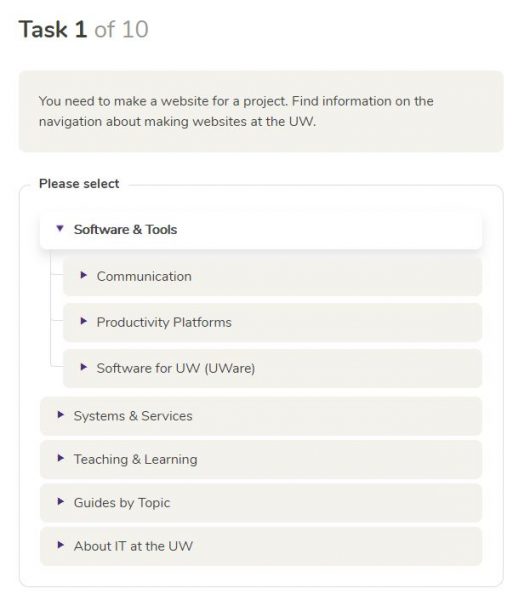
Rather than restructuring the navigation based solely on stakeholder assumptions, we used virtual card sorting to understand how users naturally grouped and labeled IT-related content.
We then used tree testing to validate the proposed structure and determine whether users could successfully locate information within the new hierarchy. This iterative approach allowed us to:
- Identify meaningful content groupings
- Test potential category structures
- Validate navigation labels
- Reduce ambiguity
- Compare alternative approaches
The research ultimately provided two navigation options for further evaluation.
From Research to Design
Translating research into an experience – The research pointed toward several design principles:
Task-oriented navigation – Organize content around what users are trying to accomplish rather than internal organizational structures.
Fewer, clearer choices – Reduce unnecessary navigation options and make top-level categories easier to understand.
Better discovery – Support both browsing and search so users can find information using the method that works best for them.
Prioritize common tasks – Bring frequently requested information and support options closer to the homepage.
Reduce visual clutter – Create a clearer visual hierarchy so users can focus on the information they need.
These principles became the foundation for the redesigned experience.
Prototype
Turning the research into an interactive experience
I translated the research findings and information architecture into an interactive Figma prototype. The prototype explored:
- Homepage structure
- Global navigation
- Content categories
- Search placement
- Information hierarchy
- Common tasks
- Header and footer patterns
The prototype allowed the team to evaluate the proposed experience before moving into implementation.
Outcome
This project established a research-informed direction for modernizing UW IT Connect’s information architecture and global user experience. The redesigned approach focused on making the portal easier to understand, navigate, and use while providing a clearer foundation for future content and design improvements.